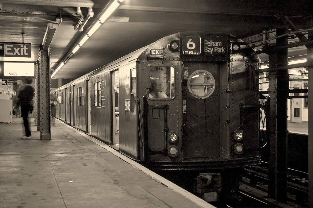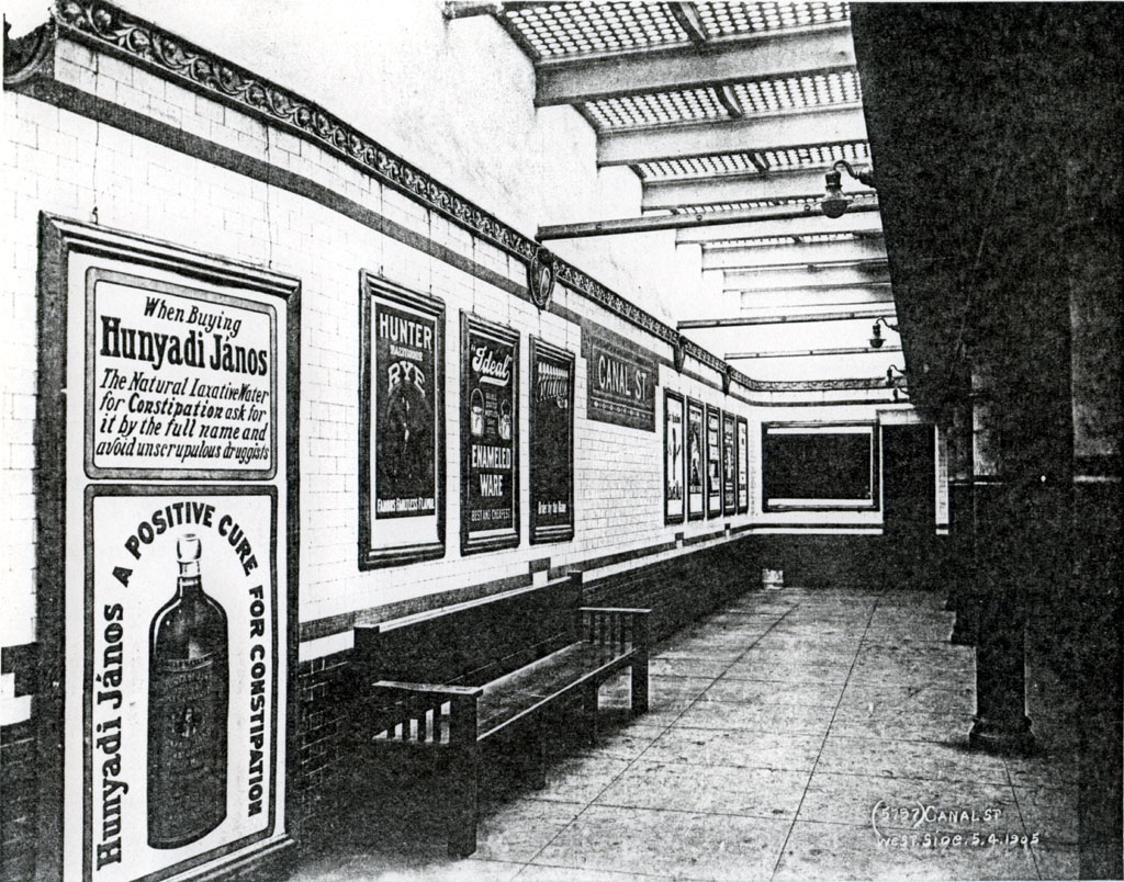
The New York City MTA is the most famous subway system in the world and is well-defined in its visual identity. Born out of the Gilded Age and finished in the Great Depression, MTA stations beautifully represent the evolution of architecture and design while reflecting the hardships the United States has adapted to.
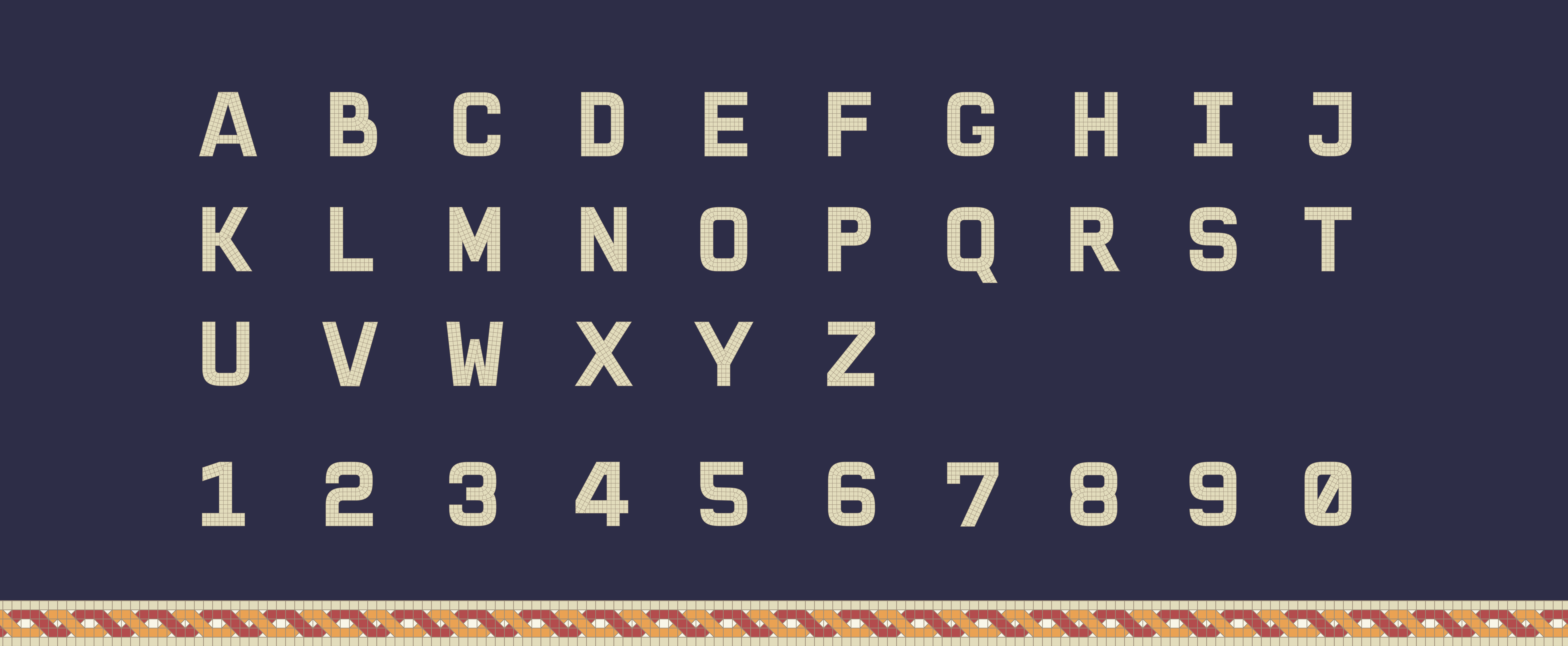
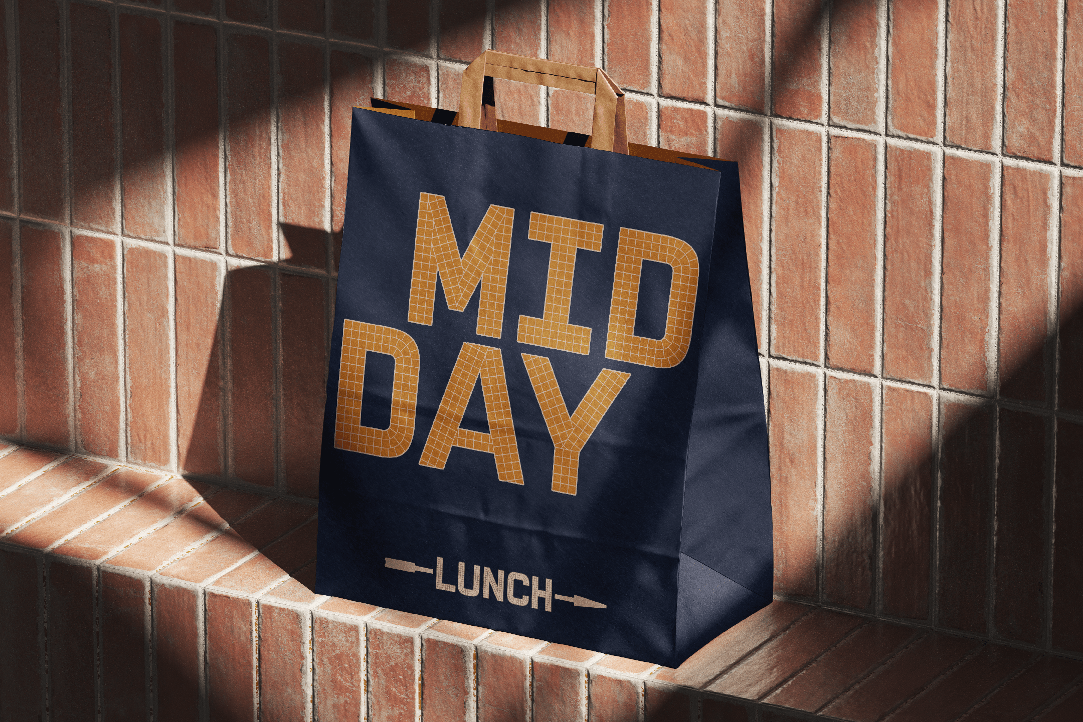
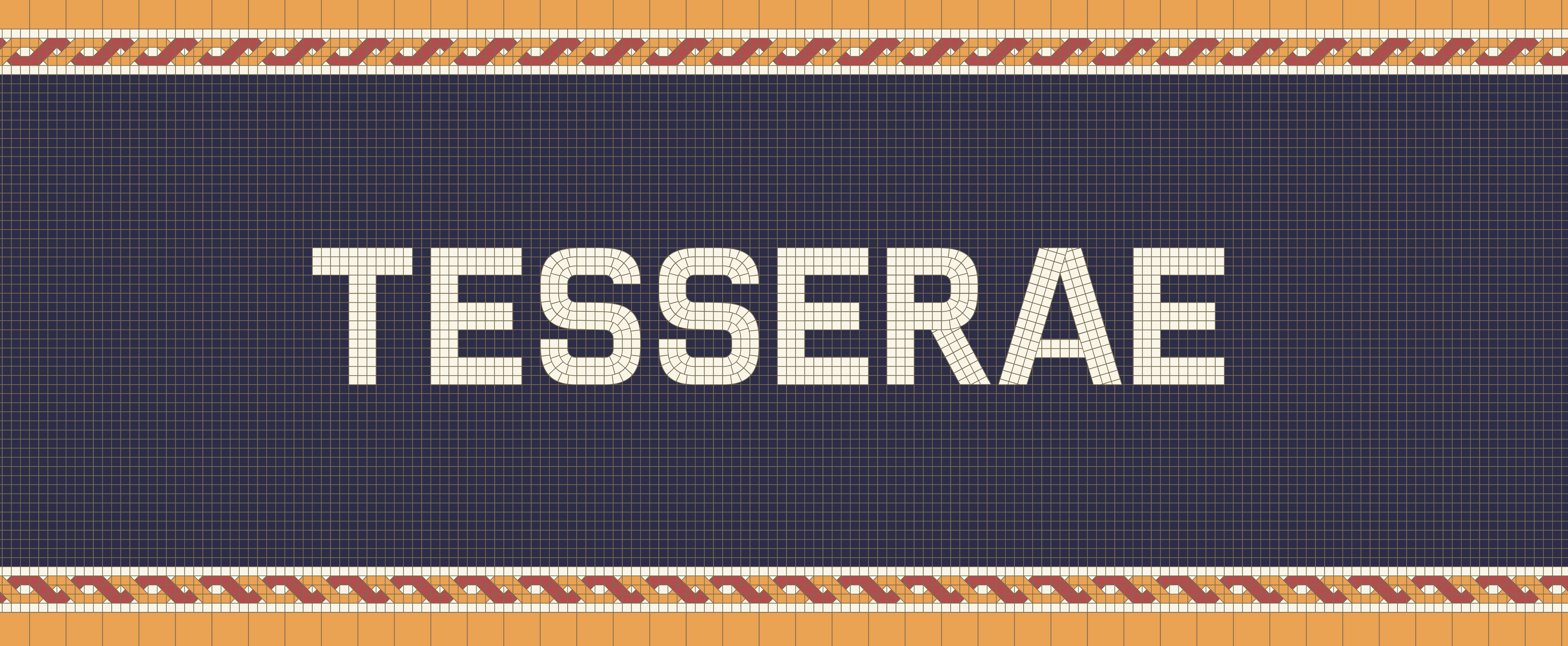
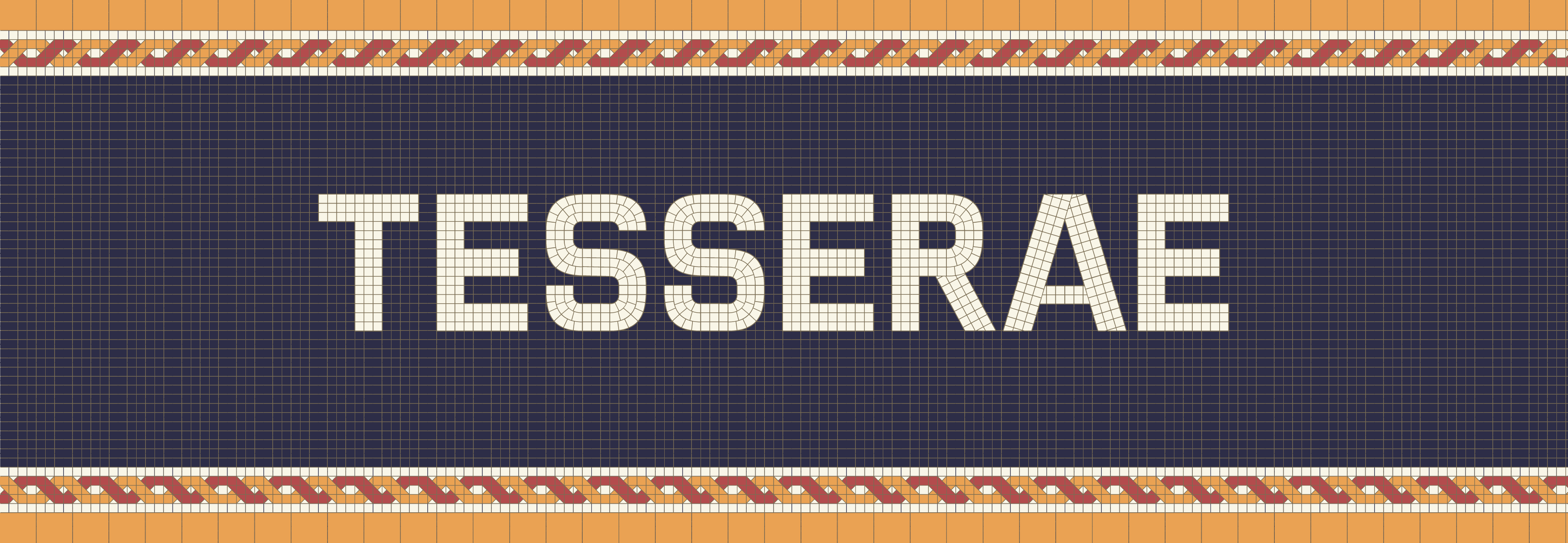
In a post-grad personal project, I created a display typeface that considers the many styles of MTA mosaics and creates a consistent series of forms that retain the personality of the subway tile work without compromising its readabilirt.
Typography, Personal Project
2026
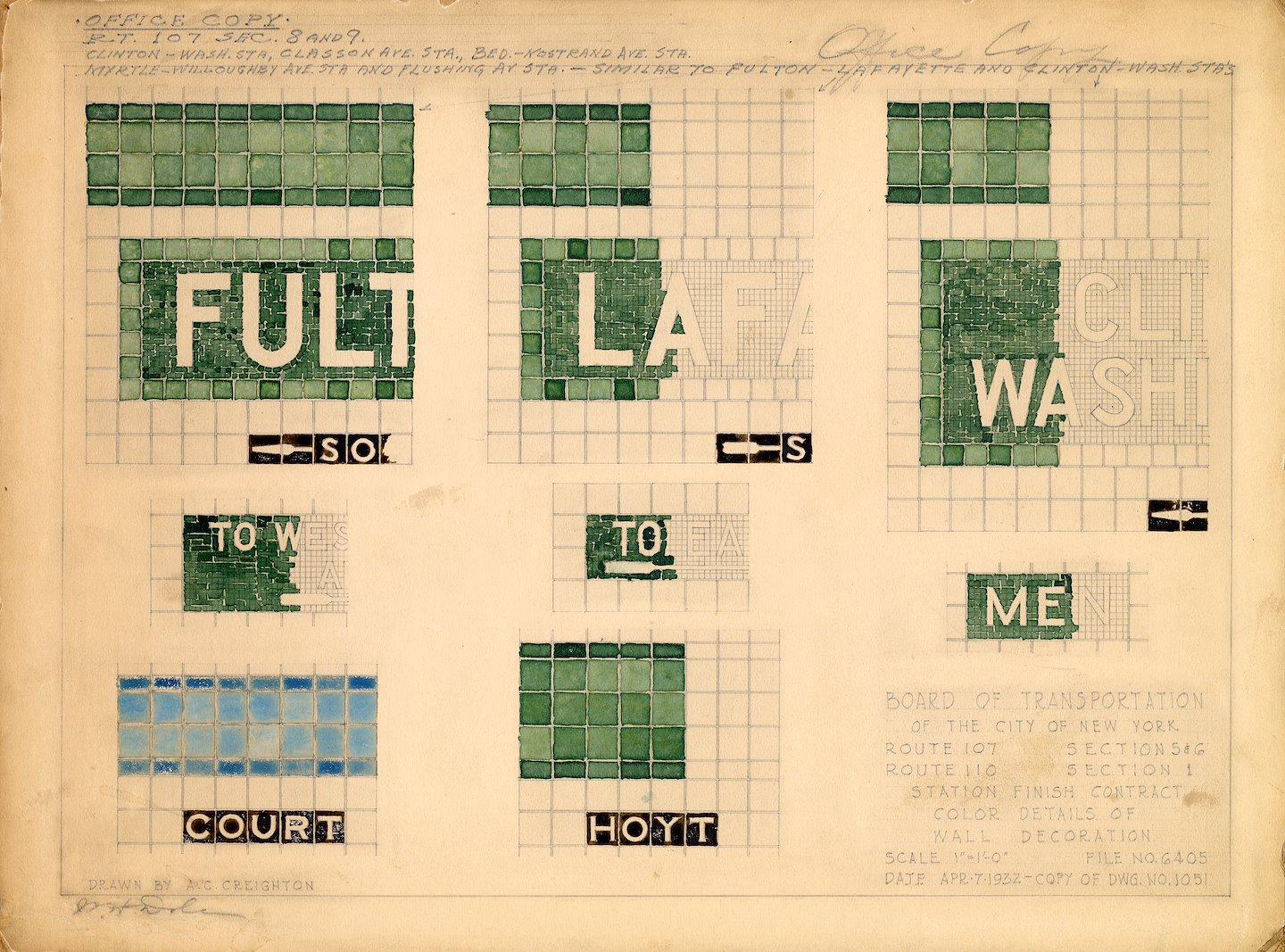
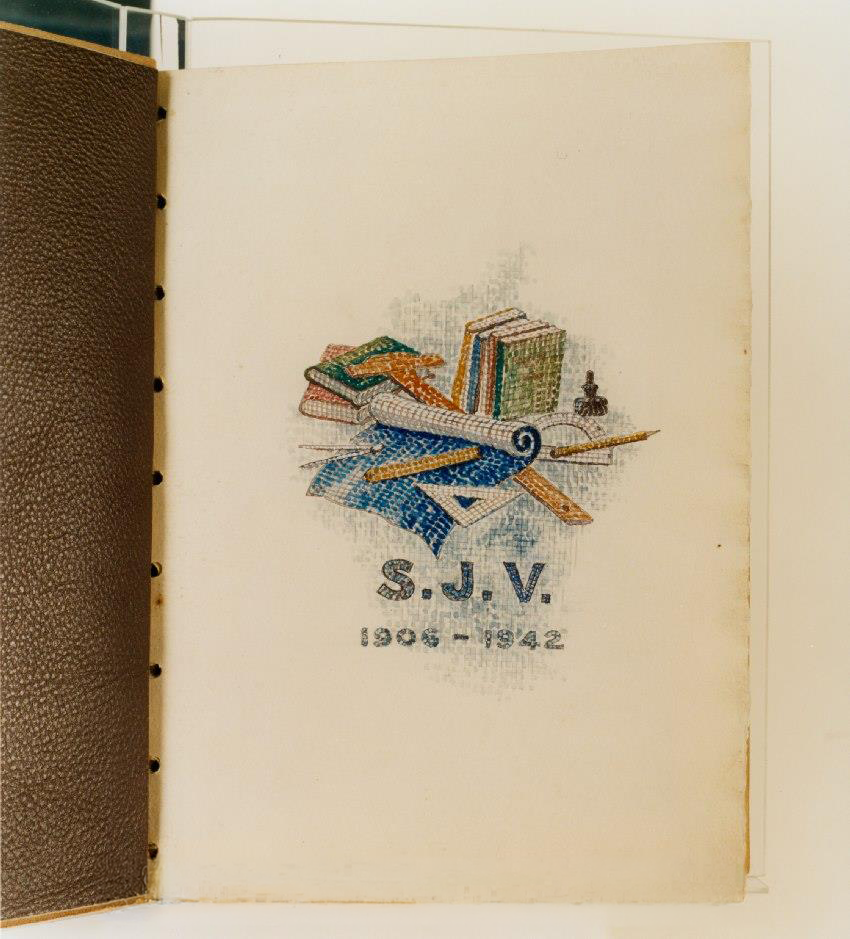
Detailed mosaic tile work became increasingly incorporated into MTA stations in the 1910's and 1920's during the Dual Contracts era where the subway system was expanded, accessibly connecting more neighborhoods than ever before. In this time period, ending in the first years of the Great Depression, over 75% of MTA stations were designed and built under the helm of chief architect and designer Squire J. Vickers.
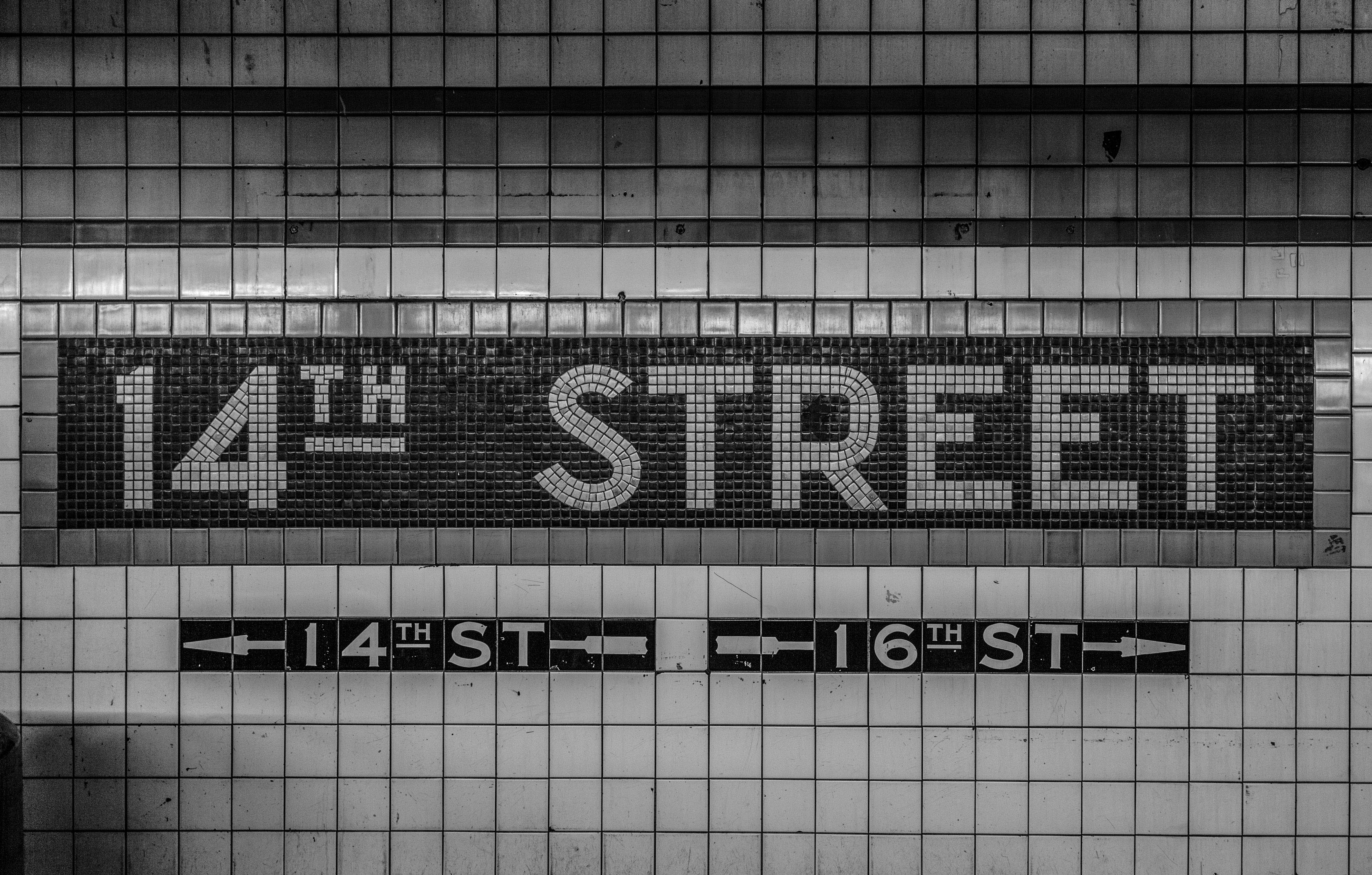
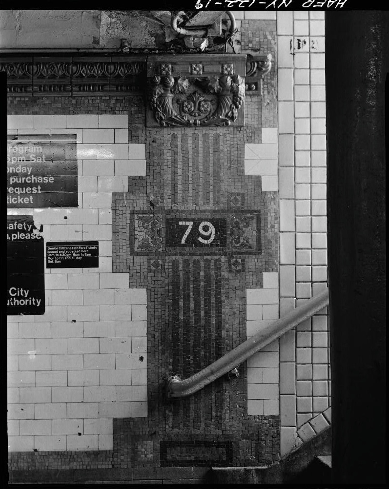
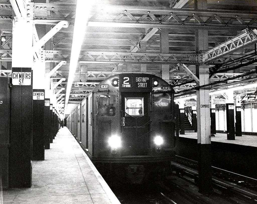
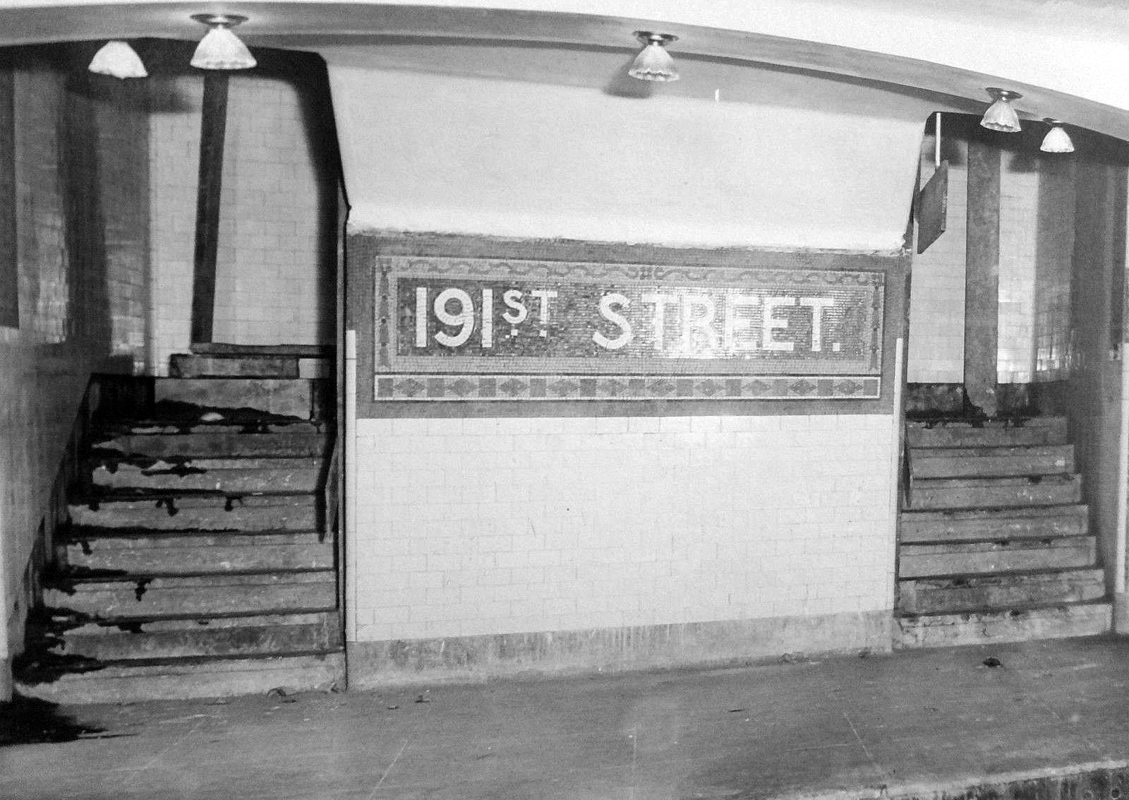
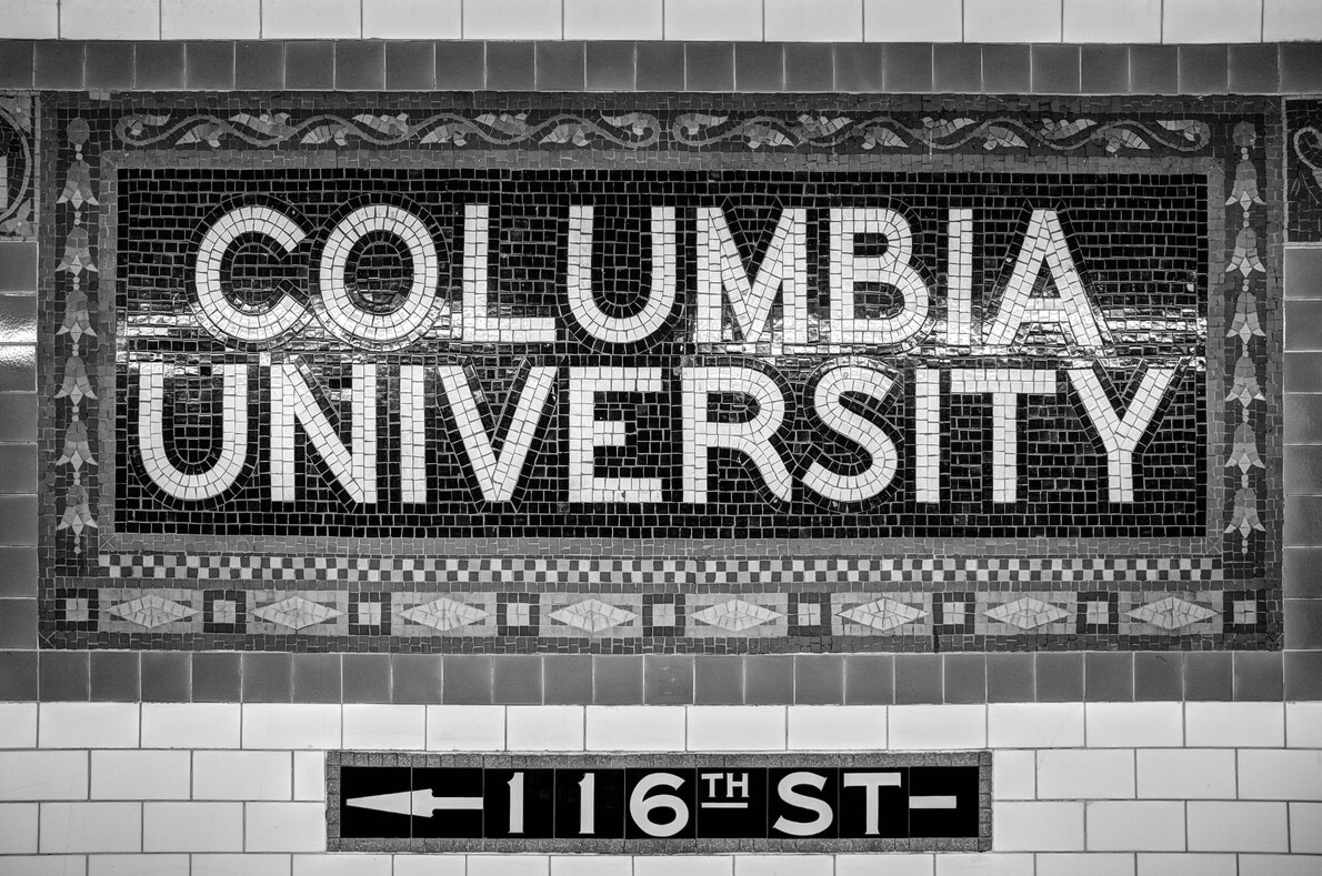
Vickers's tilework added greater consistency to MTA stations, swapping out the art nouveau-inspired raised tesserae of the later Gilded Age for flat, art deco-inspired tiles that were easier and less expensive to manufacture and assemble. This change streamlined both the installation and maintenance processes, resulting in the timeless mosaics we see to this day.
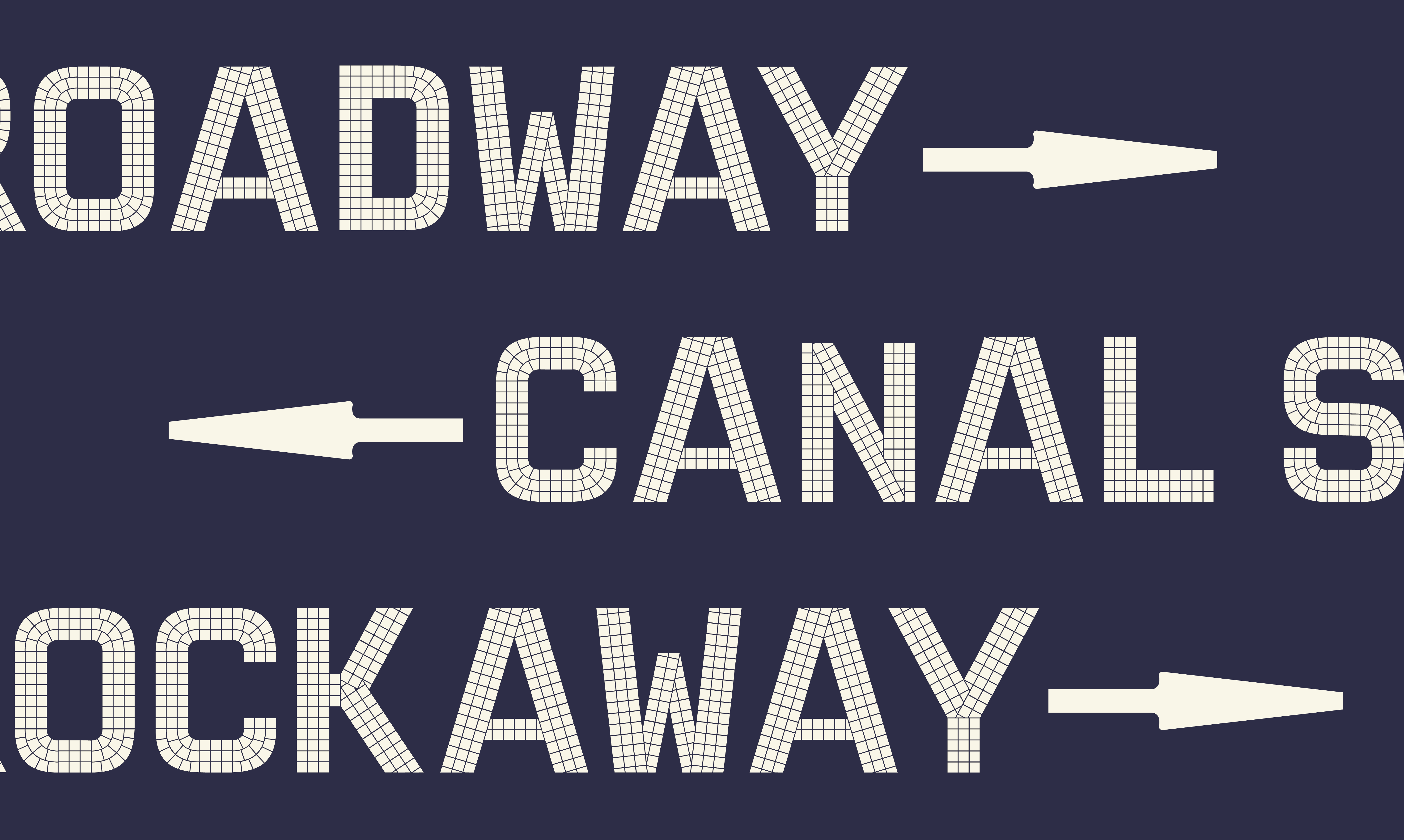
The type itself consists of mono-width, sans-serif characters constructed using square tesserae to create the vertical, horizontal, diagonal, and curved elements with minimal tile-cutting, required only on edges, curves, and at joints.
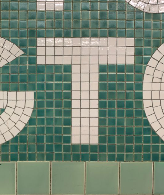
Forms consist of evenly weighted strokes to retain the factory-made shape of tesserae and create consistency between letters.
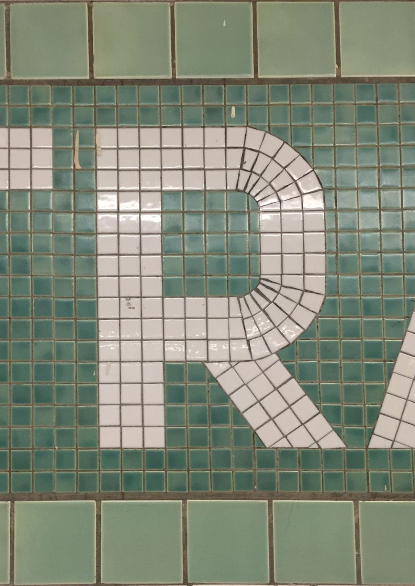
Forms with typographic bowls use straight lines with rounded corners rather than a continuous circular shape to create greater continuity amongst letters.
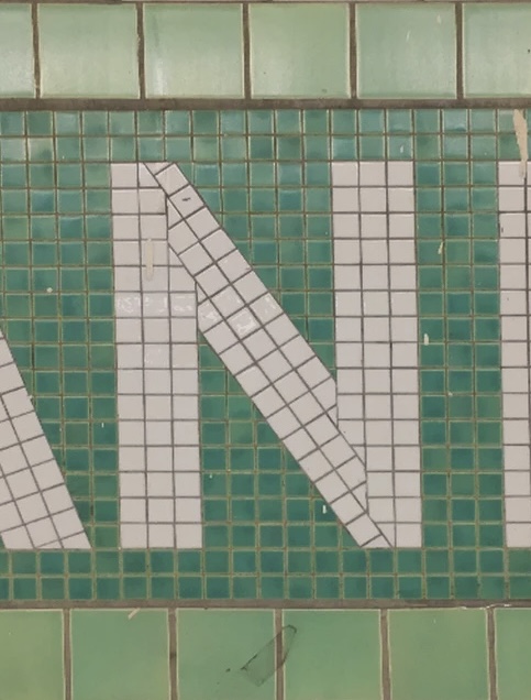
Forms that contain non-right angles, specifically when diagonal lines are featured, are made by cutting tesserae to create clean junctions and create letters without large gaps.